Block Supports
Supports are modular features that developers can add to blocks. This makes custom block development much faster as we can quickly mix various supports to create powerful custom block solutions.
These building blocks can be combined in creative ways. You can use any number of supports on a block. For example, the gallery support gives the block the ability to select multiple media items. The custom block can then be those to show a grid media gallery, slide show, carousel, or product showcase. Multiple images can be used for either Mobile and Desktop options, or Left and Right for a comparison block, or both.
Aspect Ratio
Adds a toolbar dropdown for selecting an aspect ratio.
Background Image
Set the background image to the featured image or an image upload. Provide options for blend mode, background position, size, and repeat.
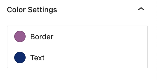
Custom Colors
Create any number of customizable colors for the block to use. For example:
"basejump/customColors": [
  {
    "name": "borderColor",
    "label": "Border",
    "default": "#A15A95"
  },
  {
    "name": "textColor",
    "label": "Text",
    "default": "#002D72"
  }
]
Flex Order
Provides responsive flex order position for blocks when placed inside of flex columns.
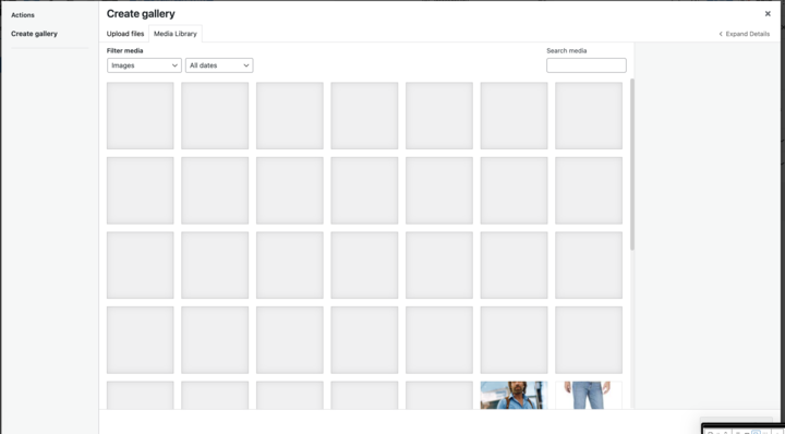
Gallery
Adds gallery image support to the block and gives the block the ability to select multiple media items. The block can then provide custom templates to use this in creative ways. For example: to show a grid media gallery, slide show, carousel, or a product showcase.
UX:
WordPress Galery:
Has Parallax
Add background parallax support to block.
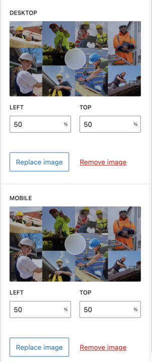
Image
Add image support to block. Multiple images can be used for either Mobile and Desktop options, or Left and Right for a comparison block, or both. Supports single or multiple images. Includes the option for selecting a focal point.
Link
Add link support to block.
Menu
Object Position
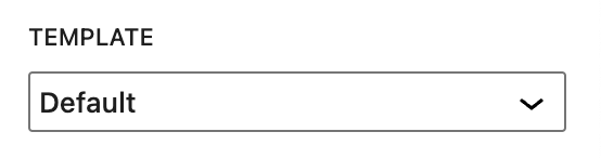
Templates
Add the ability to select a different template for the block.